Brand Identity & Packaging Case Study

Bringing the taste of Kokan to every shelf.

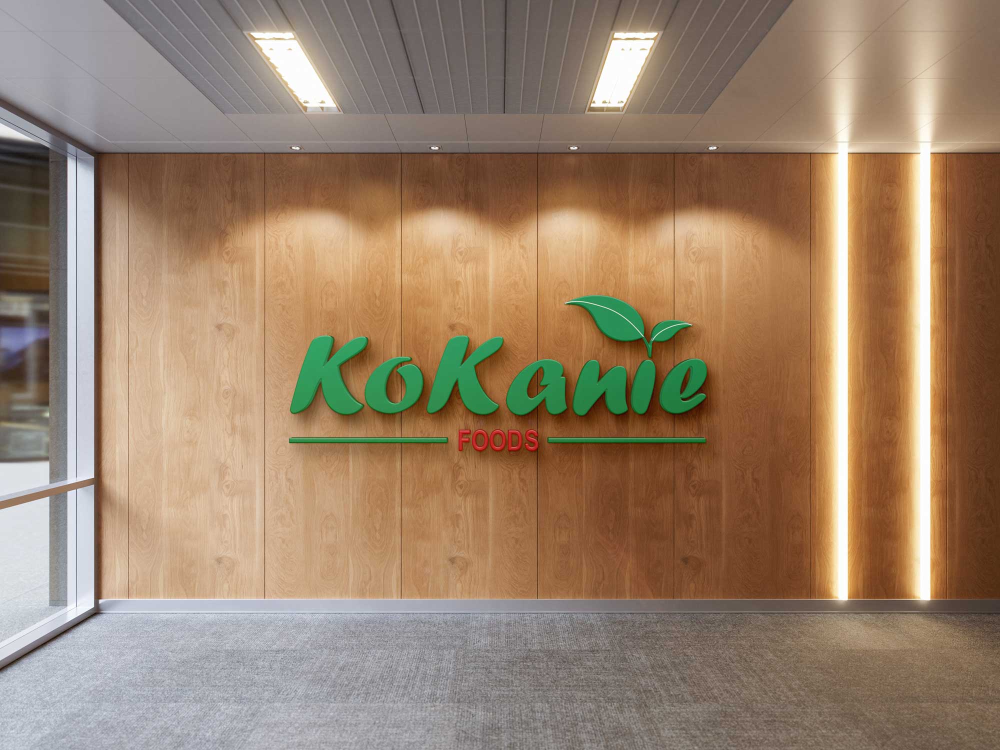
Kokanie Foods came to us with a regional snacking brand and a big ambition — carry Maharashtra's coastal flavours, from kokum to ratalayache wafors, into modern kitchens. We built the identity, the pouches, the stationery and the website that carry that story.

0+Product lines packaged
0Brand touchpoints built
0%Mobile-first delivery
SKUs designed
Packaging formats
Website sections shipped
Unified brand world
The Brief

Where we started, and where we took it.

Kokanie Foods makes packaged Kokan staples — dry fruits, fruit bars, sarbats and traditional snacks — for a generation that wants regional food without losing modern shelf appeal. Here's how the brief and our response lined up.

Client requirements

A founder-led food brand needed an identity that felt rooted in Kokan heritage, not generic "healthy snacks" packaging — and a system flexible enough to scale across nuts, dried fruit, sarbats and papads.

  • A logo that reads as fresh, natural and distinctly Maharashtrian
  • Pouch packaging consistent across 7+ very different products
  • Print stationery for invoices, visiting cards and labels
  • A responsive website that doubles as a digital catalogue

Our approach

We treated the leaf-and-script logo as the seed of the entire system — every pouch, card and screen grows from the same green-and-red language, so the brand feels like one voice across very different products.

  • Locked a logo lockup with clear minimum sizing and spacing rules
  • Built a modular pouch template — swap photo, headline colour, done
  • Extended the palette into stationery for a consistent paper trail
  • Designed mobile-first, then scaled the layouts up to desktop
Process

Four stages, one consistent story.

A real sequence we followed end to end — each stage's output became the next stage's starting material.

01

Discover

Mapped the product range, the Kokan visual references and the competitive shelf to find what "regional but modern" should actually look like.

02

Design

Sketched logo directions, tested the green-and-red lockup against white and kraft backgrounds, and built the first pouch template.

03

Build

Rolled the identity out across all SKUs, stationery and the responsive website, checking consistency at every breakpoint.

04

Deliver

Handed over print-ready packaging files, brand guidelines and a live, mobile-first website ready for the next product launch.

Mood Board

The references that set the direction.

Coastal greens, kokum reds and sun-dried golds — the colours of the produce itself became the brand's working palette.

Kokum sarbat bottle, magenta tones
Almonds pouch, maroon tones
Kokan Leaf
#049548
Chilli Red
#e11e24
Aamboshi pouch, mango gold tones
Sun Gold
#c8862b
Ratalayache wafors pouch
What we delivered

One identity, every touchpoint.

From the first sketch of the logo to the live website, everything below shares the same visual DNA.

Logo & identity

Primary lockup, leaf mark, colour and spacing rules

Packaging

Pouch system across 7 product lines and 2 bottle SKUs

Stationery

Visiting cards, letterheads, invoices and labels

Website

Mobile-first, fully responsive product showcase site

7 SKUsOne pouch template
Kokanie aamboshi packaging pouch
Packaging & Synopsis

One template, seven personalities.

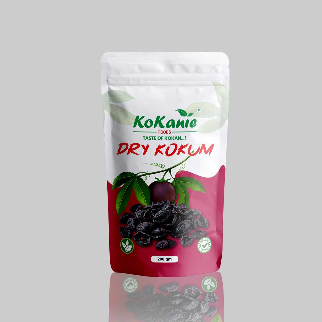
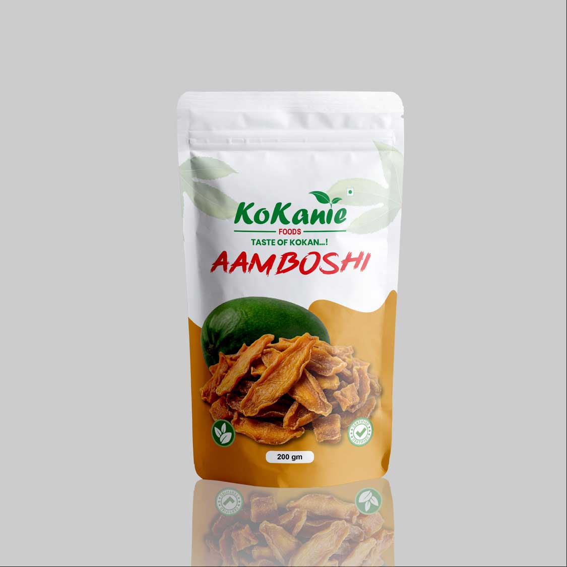
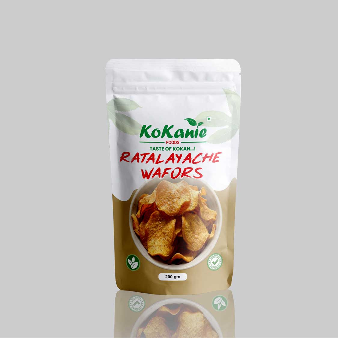
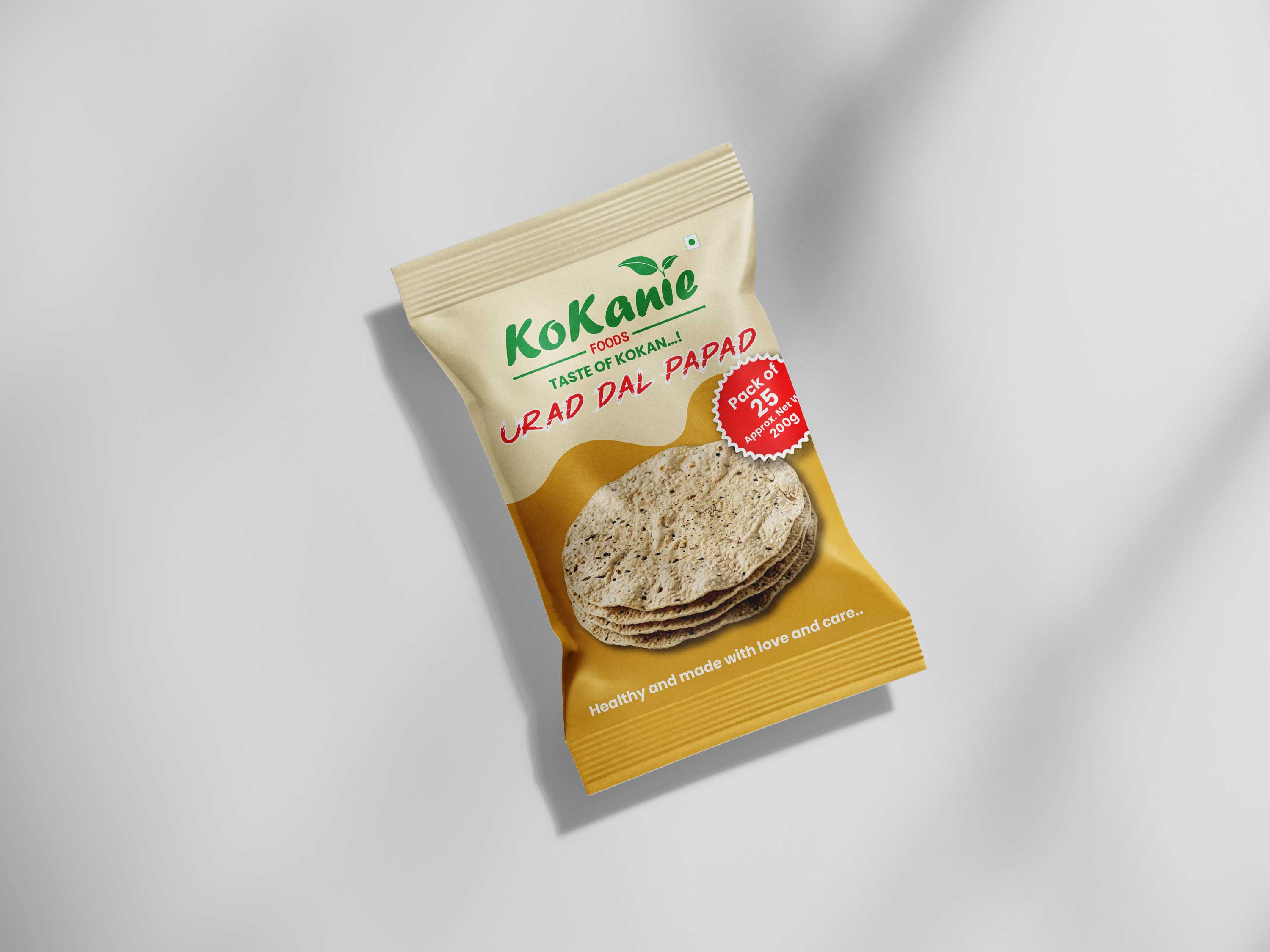
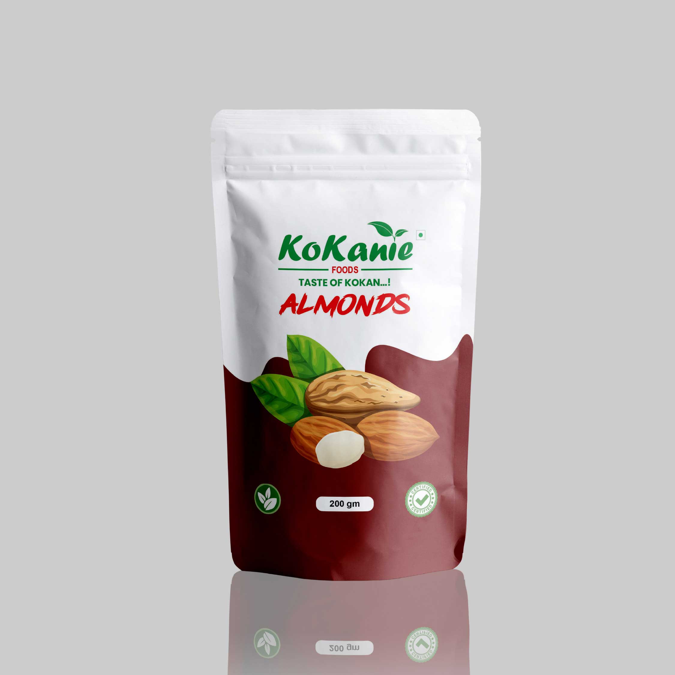
Every pouch shares the same white crown with the logo lockup and a "Taste of Kokan...!" strap, then drops into a colour and photo specific to what's inside — maroon for almonds, mustard for aamboshi, magenta for dry kokum, olive-gold for wafors. The product photography sits large and centred, so the pouch reads clearly from across a shop counter, with weight, certification and leaf icons standardised in the same three positions on every bag.

200gStandard pack size
5Accent colourways
2Pack formats
Kokanie Almonds 200g pouch
Almonds
200 gm stand-up pouch
Dry Fruits
Kokanie Aamboshi 200g pouch
Aamboshi
200 gm stand-up pouch
Dried Fruit
Kokanie Dry Kokum 200g pouch
Dry Kokum
200 gm stand-up pouch
Dried Fruit
Kokanie Ratalayache Wafors 200g pouch
Ratalayache Wafors
200 gm stand-up pouch
Snacks
Kokanie Urad Dal Papad pack
Urad Dal Papad
Pack of 25, ~200 gm
Snacks
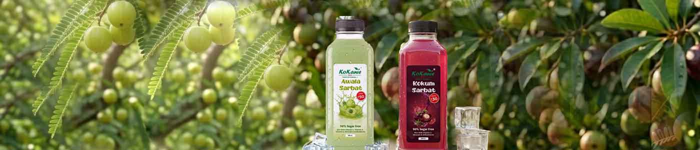
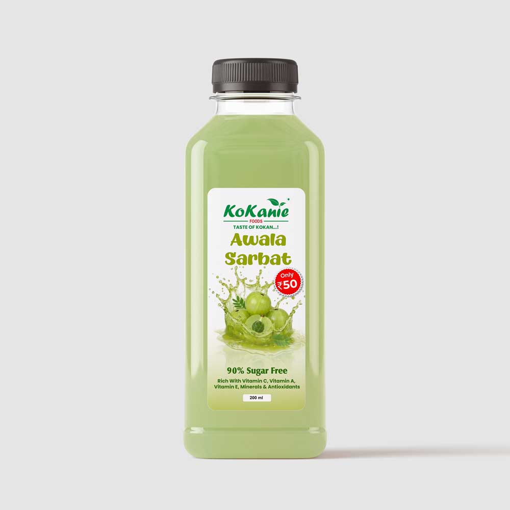
Kokanie Awala Sarbat bottle
Awala Sarbat
200 ml glass bottle
Beverage
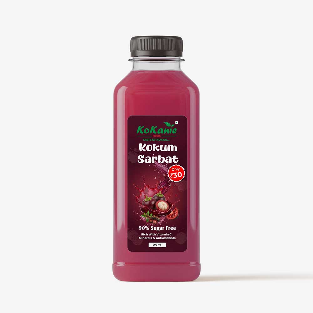
Kokanie Kokum Sarbat bottle
Kokum Sarbat
200 ml glass bottle
Beverage

More SKUs in production, same template, same shelf voice.

Typography & Colour

The system behind the surface.

A script for warmth, a sans-serif for clarity, and a palette pulled straight from the produce itself.

Display — wordmark & headlines
KoKanie
Used for the logotype and key packaging headlines — loose, brush-formed, never used for body copy.
Utility — body, labels, packaging copy
Taste of Kokan...!
A clean grotesque sans for taglines, weights, certifications and anything that needs to stay legible at small print sizes.
Kokan Leaf#049548
Chilli Red#e11e24
Sun Gold#c8862b
Bark#15241A
Husk Cream#F2EDDD
Mobile-first buildDesigned at 375px up
Responsive Website

A digital shelf that scales down first.

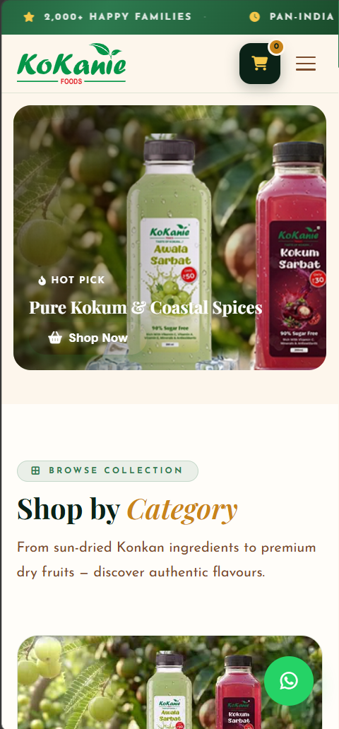
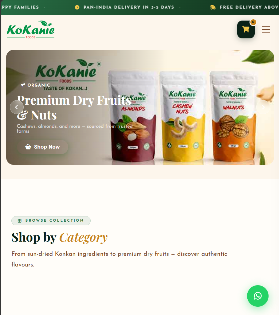
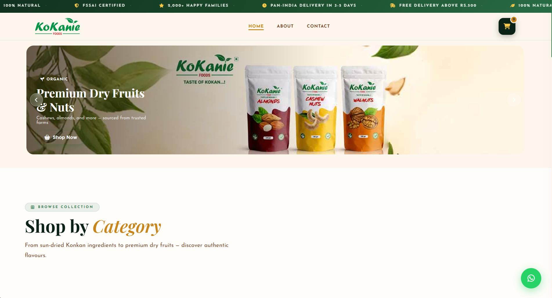
The site was wireframed for a 375px phone screen before a single desktop layout existed — because that's where most of Kokanie's customers actually shop. The same product cards, navigation and CTA patterns then scale up cleanly to tablet and desktop, so nothing was bolted on afterward; every breakpoint was a deliberate decision.

6Page sections
3Breakpoints tuned
<2sTarget load time
Mobile
Mobile view of the Kokanie Foods website product page
Tablet
Tablet view of the Kokanie Foods website product grid
Desktop
Desktop view of the Kokanie Foods website homepage

DRSHYTEC understood that our products needed to feel like home before they felt like a brand. Every pouch, every card, every screen still says Kokan first.

K
Founder, Kokanie Foods
Maharashtra, India

Start Your Project With Us

Let DRSHYTEC Solutions craft a complete brand identity for your business — from logo to packaging to a responsive website. Every detail, every surface, every touchpoint.

Start Your Project View More Work